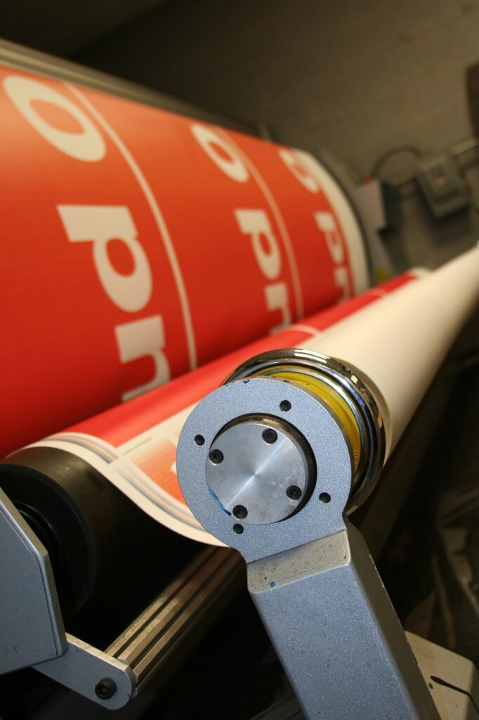
Selecting the perfect font for your signage is crucial for effective communication and brand representation. Fonts play a significant role in how your message is perceived, influencing readability, aesthetics, and overall impact. In this detailed guide, we’ll explore how to choose the right fonts for your signage to ensure your messages are clear, engaging, and aligned with your brand identity.
Understand Your Signage’s Purpose
The first step in choosing the right font for your signage is understanding its purpose and context.
Type of Signage
Consider the type of signage you need: is it for a storefront, directional sign, event banner, or promotional display? Different types of signage require different approaches to font selection.
Audience and Location
Think about who will be reading your signage and where it will be placed. Fonts that work well in a retail environment may not be suitable for a directional sign at a crowded event.
Prioritize Readability
Readability is essential for any signage. Your font should be easy to read from a distance and in various lighting conditions.
Font Size and Legibility
Choose fonts with clear letterforms and adequate spacing. Avoid overly decorative fonts that may hinder readability, especially from a distance. Test different sizes to ensure your text remains legible.
Contrast and Color
Ensure high contrast between your font color and background. Dark text on a light background or vice versa is usually the most readable combination. Consider how your font color will stand out in various lighting conditions.
Reflect Your Brand Identity
Your font choice should align with your brand’s identity and message.
Matching Your Brand’s Tone
Fonts convey different emotions and tones. For a modern, sleek brand, consider sans-serif fonts like Helvetica or Arial. For a more traditional or elegant look, serif fonts like Times New Roman or Garamond might be appropriate.
Consistency Across Media
Ensure that your chosen font is consistent with other brand materials, such as your website, brochures, and business cards. Consistency reinforces brand identity and creates a cohesive visual experience.
Choose the Right Font Style
Different fonts come with various styles and weights that can affect your signage’s appearance and effectiveness.
Serif vs. Sans-Serif
Serif fonts have small lines or strokes at the ends of letters, giving them a classic and formal look. Sans-serif fonts, which lack these lines, offer a modern and clean appearance. Choose based on the tone you want to set.
Font Weight and Style
Experiment with different font weights (light, regular, bold) and styles (italic, uppercase) to emphasize important elements of your signage. However, avoid using too many variations to prevent a cluttered look.
Test for Versatility
Your chosen font should work well across various types of signage and materials.
Scalability
Ensure your font maintains its legibility and aesthetic appeal when scaled up or down. Test how the font looks in different sizes and formats, especially if it will be used for both large banners and small directional signs.
Compatibility with Materials
Consider how your font will appear on different materials, such as vinyl, fabric, or acrylic. Some fonts may look different depending on the medium and printing method used.
Evaluate Font Pairing
Sometimes, using more than one font can enhance your signage, but it’s crucial to pair fonts effectively.
Complementary Fonts
If using multiple fonts, ensure they complement each other. Pair a primary font with a secondary one that contrasts in style but remains harmonious in terms of readability and design.
Hierarchical Structure
Use different fonts to establish a clear hierarchy in your signage. For instance, a bold font for headings and a simpler font for body text can help guide the viewer’s attention and improve readability.
Consider Legality and Licensing
Ensure that the fonts you choose are legally licensed for commercial use.
Font Licensing
Some fonts require a license for commercial use, especially if used in signage. Verify that you have the appropriate permissions to avoid any legal issues.
Open-Source and Free Fonts
If on a budget, consider open-source or free fonts that come with commercial-use licenses. There are many high-quality options available that can be used legally for signage.
Seek Professional Guidance
If you’re unsure about font selection or how it will impact your signage, seek advice from a design professional.
Graphic Designers
Graphic designers can provide expert advice on font choice, pairing, and overall design to ensure your signage achieves the desired effect.
Printing Specialists
Consult with printing specialists to understand how your chosen font will appear in print. They can provide insights into font performance across different materials and printing methods.
Conclusion
Choosing the right fonts for your signage involves careful consideration of readability, brand identity, and design principles. By understanding your signage’s purpose, prioritizing legibility, reflecting your brand’s tone, and testing font versatility, you can create impactful and effective signage that enhances your message and captivates your audience.
GRAPHICS GROUP – The Group of Graphics Companies – is here to assist with all your signage needs. From expert font selection to high-quality printing, GRAPHICS GROUP delivers exceptional results that elevate your brand’s visibility and impact. Contact GRAPHICS GROUP today to explore how we can help you achieve outstanding signage solutions.

